
App Ideation and UX Design
TASK ALLY
This is a conceptual idea that began in college but became closer to home for me after watching my dad struggle to care for my grandmother, who was in the early stages of dementia. It became increasingly difficult for him to reach her to check in or remind her of basic daily tasks—like taking specific medications or tracking her blood sugar levels, as she has diabetes. She was no longer able to manage these tasks on her own, often forgetting them, taking the wrong medications at the wrong time, skipping meals, or simply being unreachable because she had misplaced her phone and couldn’t remember where it was.
My design process always begins with empathy and understanding the audience/users
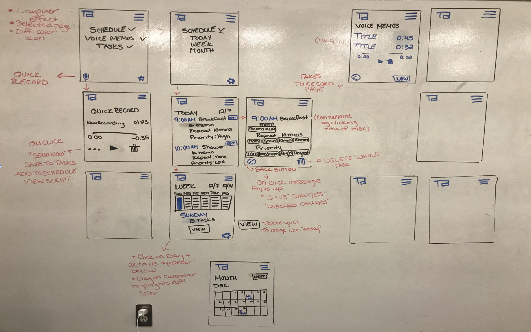
My initial concepts and ideas for functionality were drawn out on a white board.
Many older adults with Alzheimer’s or dementia struggle to remember daily tasks. The responsibility to remind them and ensure these tasks are completed often falls on their caregivers or family members. However, caregivers and family can’t always be with them throughout the day—and due to busy schedules, work, or other circumstances, it’s not always possible to call and provide reminders.
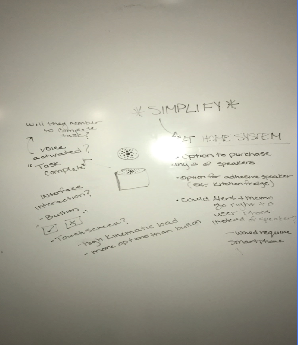
Task Ally - A system that consists of smart speakers and mobile app designed for caregivers or family members of individuals with Alzheimer’s
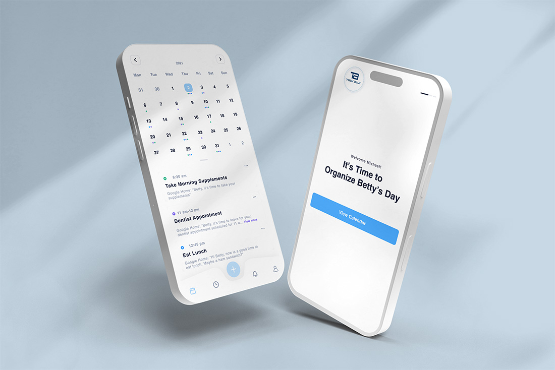
The app allows users to schedule and send voice reminders to the speakers, which are placed in different rooms and connected via Wi-Fi. Reminders can be prerecorded, repeated at intervals, and stored for future use.
Speakers are small, voice-activated, and include a button for task confirmation. Once a task is marked complete, either by voice or button, an alert is sent to the caregiver through the app.
The system serves as an ally to caregivers, making it easier to provide support while helping individuals manage daily tasks without needing constant contact with the caregiver.
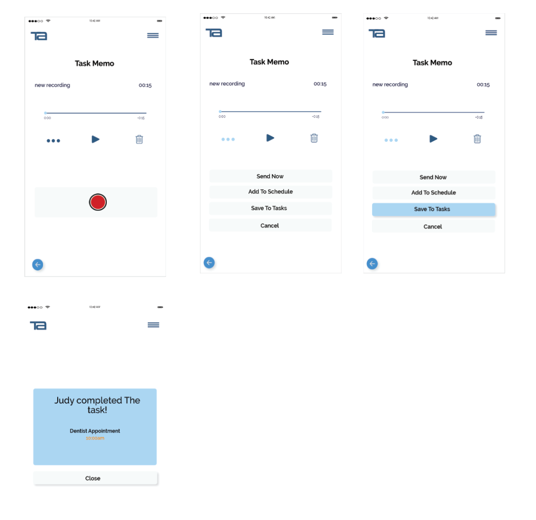
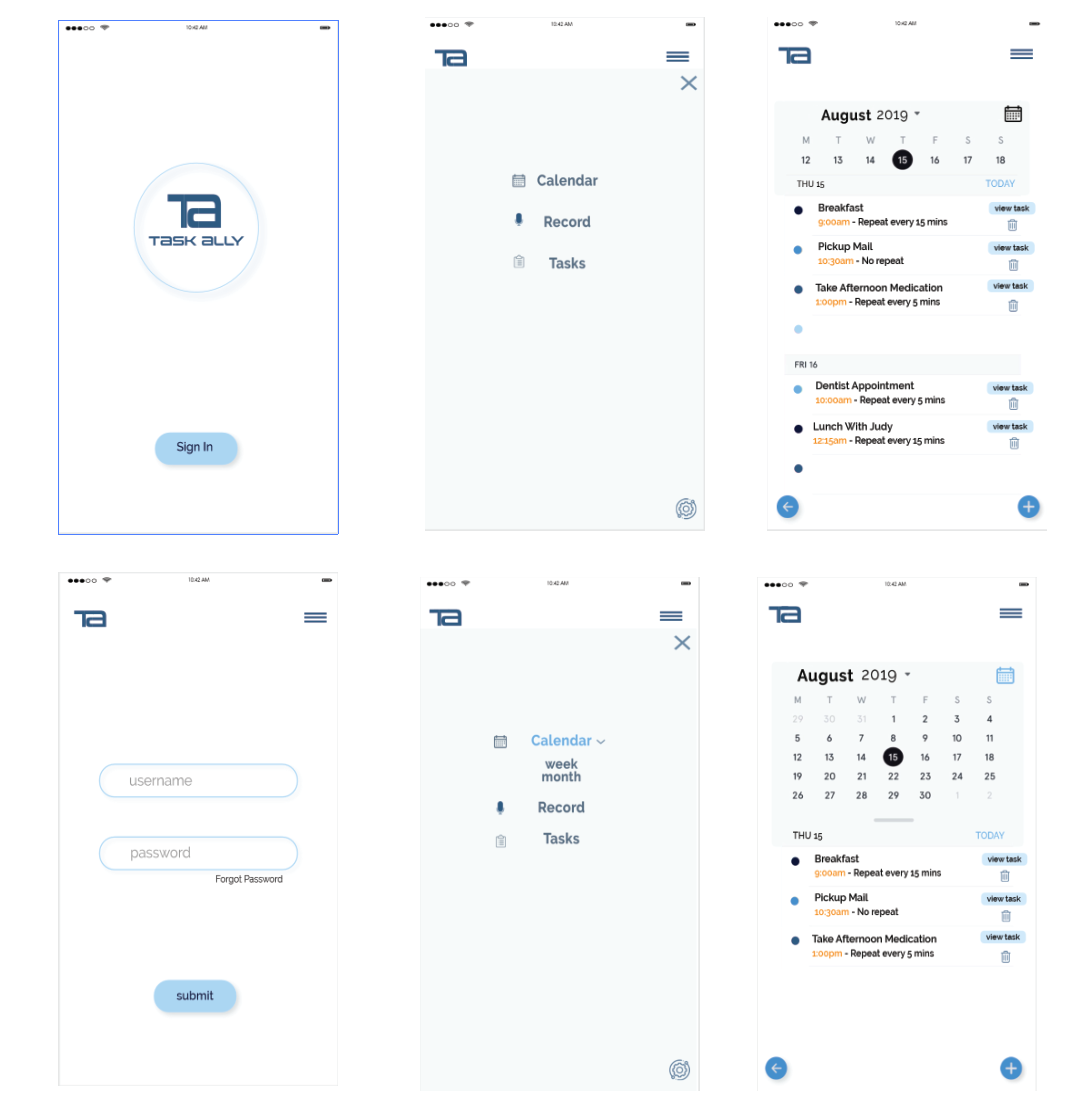
The first version included a hamburger menu with nested categories like Tasks, Schedule, and Voice Memos. While functional, it required too many taps to complete simple actions. The interface lacked strong hierarchy, making it difficult for users to know where to start or what required attention. I recognized there were multiple areas that needed to be re-designed and improved.
Yes - my use of drop shadows in my wireframes above should be illegal...fear not though, this was early in my design days and a lot of growth has happened since
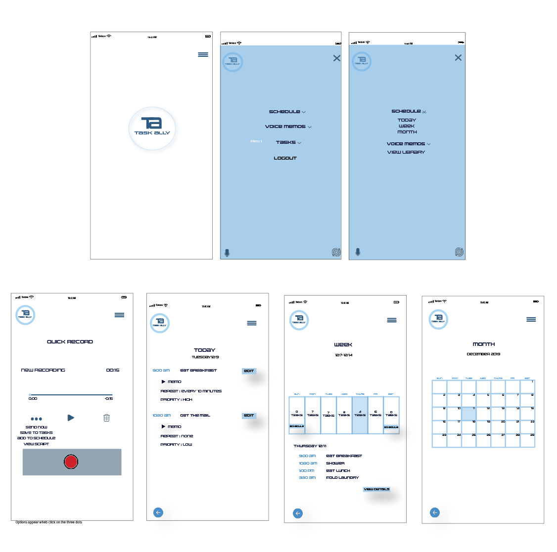
Below are the revised wire frames.
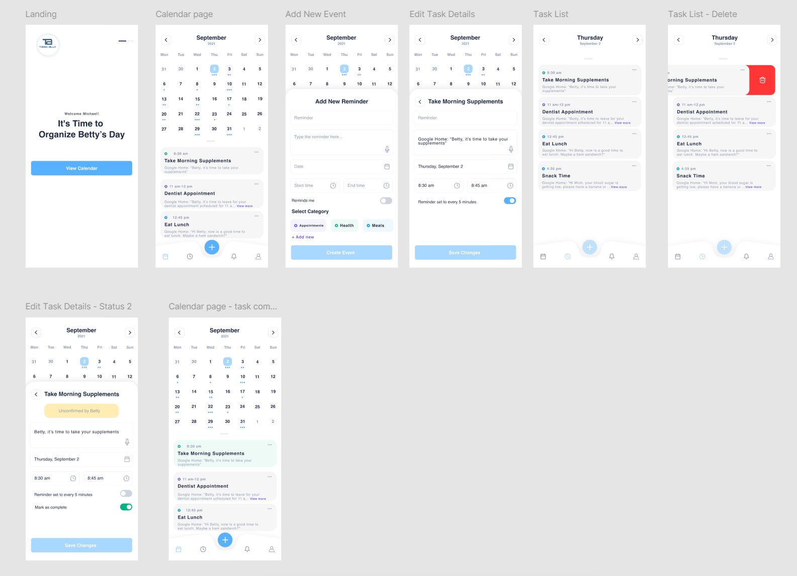
The redesigned wireframes create a much cleaner, more intuitive experience. By reducing unnecessary complexity and aligning interactions with user expectations, the interface feels approachable and efficient. Users can now view, add, and manage tasks from a single, central calendar view, improving both usability and overall flow.
1. Clarity Beats Complexity: More features don’t equal better UX; prioritizing visibility and simplicity drives usability.
2. Information Architecture Matters: Combining related functions (Tasks + Schedule) significantly reduced confusion.
3. Consistency Builds Trust: A unified visual language and predictable navigation strengthen the user’s sense of control.
4. Iteration Is Essential: Moving from my early wireframes to this refined version reinforced how testing and critical evaluation lead to stronger design decisions.